Trendy Pornography character set
fig 1:
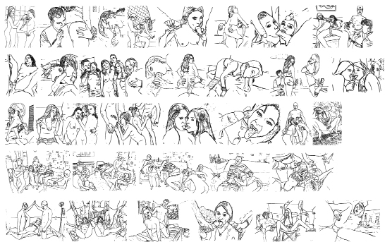
By typing the ‘a’ an image of three women in a tiled room appears; one woman cups the breasts of another from behind, while said woman licks the breast of the third. The ‘b’ reveals a man kissing the butt-cheek of a woman in a G-string; the same man turns up again if you type ‘p’. Typing a ‘c’ reveals a portrait of a woman looking at us while performing fellatio; the only other discernible object in this glyph is a wall socket in the background. And so on it goes: ‘e’, ‘f’, ‘g’, ‘h’, etc., reveal a myriad of sex acts in various domestic environments. Kitchens, lounges, bathrooms, bedrooms… What is being described here is a font called ‘Trendy Pornography’– designed and published by the French graphic designer, photographer and film-maker Fabien Delage, who seems to be the sole and founding representative of a ‘pop erotic photography movement’. His other font designs are a mixture of pop-horror and comic/graffiti/gaming/sci-fi dingbats, so, along with ‘pornography’, we encounter the all – too – familiar construct and pursuits of the young, male, adult mind. The font itself is loose, lacking the characteristics that make a professional type design legitimate: similar stroke weights, a clear system, legibility, etc. But nevertheless it is a fascinating thing, illustrating a kind of ‘second nature’ that is embodied, or latent, in much graphic work. To begin to ponder levels of eroticism in digital letterforms becomes quickly blurry and convoluted, silly even, but Delage’s font somehow triggers the thought.
‘Papyrus’ Tweet
fig 2:
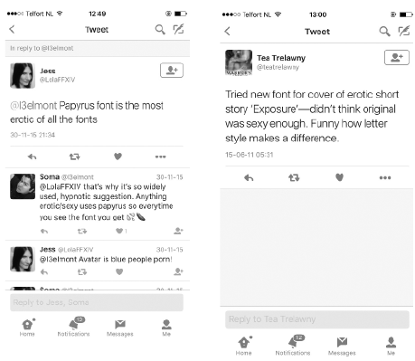
A cursory search on Twitter calls up many descriptions of erotic associations with fonts; often they are funny and sometimes absurd, but nevertheless the [initially] text-led social media platform of Twitter is an interesting encounter with such ideas. On the 30th November at 21:34 @LolaFFXIV tweeted to @I3elmont ‘Papyrus font is the most erotic of all the fonts’, to which @I3elmont almost immediately replies ‘that’s why it’s so widely used, hypnotic suggestion. Anything erotic/sexy uses Papyrus so every time you see it you get [emoji of 3 drops of water], [emoji of an aubergine]’. @mtvdad tweets ‘times new roman is the most erotic font’ to which @daddycarmilla replies ‘I CAN’T BREATHE OMFG U R RIGHT’. ‘The biggest challenge with writing something erotic is choosing the appropriate font,’ Tweets @guiltybyd3sign and @teatrelawny. ‘Tried new font for cover of erotic short story Exposure – didn’t think original [font] was sexy enough. Funny how letter style makes a difference.’ These tweets show that a font can be itself an object of erotic desire as well as a thing that tries to convey it.
The Erotic Soviet Alphabet From Sergey Merkurov, 1931
fig 3:
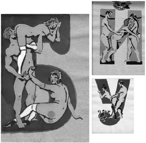
As strange as it might seem there is a long history linking alphabetical letters to the body. Whether it be through the gesture of writing, like in calligraphy, where the author’s hand implies a layer of meaning, or, like in anthropomorphic alphabets, where the letter and the human form are combined. For example, in the Irish Book of Kells, where illustrated human figures ‘inhabit’ the initial letterforms to the text, with one aim being that even an illiterate would have access – and also their position defined – to the (sacred) text in front of them. In a related way, but closer to our topic, in 1930s Soviet Russian Sergey Merkurov designed a primer to help people learn the Cyrillic alphabet. His method of doing this was to ‘illuminate’ the letters with sex acts, the figures strangely contorted to the forms of the letters, producing some rather inventive ‘positions’. Depending on the letterform, a single naked person, a copulating couple or some group sex can be accommodated; on two occasions there is a Sabbatic Goat in the mix; also angels and even a monkey join in the fray. In some letters there are cute illustrations of penises with wings, which usually indicate an accent to the letter. In the ‘T’ a naked (and crowned) woman holds a disembodied penis in either hand of her spread arms, which appears to provide a formal/visual function as a serif to the letterform itself.
Alfred Kallir Sign and Design book cover, 1961
fig 4:
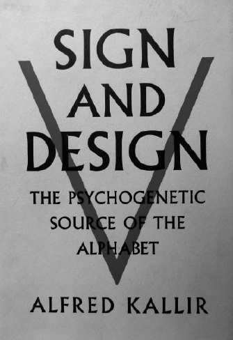
In the 1940s the autodidact letterform historian Alfred Kallir began to study the alphabet in search of visible evidence of ‘primal urges’ and ‘psychic desires’. In 1961 he published a book called Sign and Design: The Psychogenetic Source of the Alphabet in which he exhaustively examines the genealogy and development of the first three letters of the Latin alphabet. In his analysis of the letter ‘B’, among other things, he describes a complex distillation of lips (in profile), a child’s prelinguistic ‘bubbles’, and the maternal breasts. Kallir’s study presents the idea that the alphabet is a technology concealing a deep and complex integration of the mind and the body.
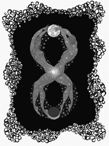
Erté alphabet
fig 5:
The French philosopher and literary theorist Roland Barthes wrote, on many occasions, about the connotations and effects of the alphabetic letterform on a viewer. He wrote that the natural state of the letter – when alone – is innocent, and it is when we start to make words that this innocence is lost: ‘Evil begins with the word’. He wrote this when describing the graphic artist Erté’s (Romain de Tirtoff) beautifully illustrated alphabet of women rendered in an art deco style – which in the 1970s, around the time Barthes was writing his text, had experienced a revival in popularity. In this essay Barthes also wrote about the relationship between the letter and the body being manifest in the motif of the silhouette: ‘The silhouette, if only by its etymology, is a strange object, at once anatomic and semantic: it is the body which has explicitly become a drawing. […] The silhouette is an essential graphic product: it makes the human body into a potential letter, it asks to be read’. This idea suggests a ‘circular’ relationship that we can have with letters, that they can be both objects and expressions of desire.
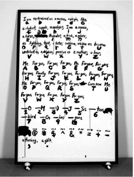
Sade for Fonts Sake, Paul Chan 2008, ink on paper and mixed media
fig 6:
We all know that, by typing, we can produce orthographies and emoticons with erotic connotations, that are globally recognizable: XXX, 69, | /, (.) (.), .|. , etc… but what if that idea is taken to an extreme? As a complement to his 2009 video work Sade for Sade’s Sake, the artist Paul Chan produced a set of 21 digital fonts collectively titled Sade for Fonts Sake. Each font in the set is named after a character in history whose life is somehow knotted with sex and language. Expressions of eroticism, indecency, entertainment, forbidden desire, climax, etc. all find their way into the font. Always preceded by the utterance Oh the fonts mostly, informally and personally, take the first name of their subject. For example there is ‘Oh Monica’, after Monica Lewinsky and ‘Oh Gertrude’, after Gertrude Stein. There are also more anonymous and general names for the fonts like ‘Oh Boy’ and ‘Oh Romans’. Each font, in use, is intended to create a generative ‘Sadian performance’ as you type, meaning that when a letter is typed, instead of this letter appearing on your screen, a group of words show up that form a sexualized declaration related to its subject. In ‘Oh Monica’ if you type ABCDEFGH this is what appears:
‘I need it, I know, I want it, Mister I deserve it, I need it, my God I am yours’
As well as being a lot of fun to use, the fonts can produce wild erotic texts, and – in their seeming randomness – provoke truly erotic sensations in reading.
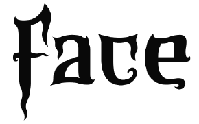
Microfoundry’s ‘Domination Available’
fig 7:
In the more technical and black – and – white world of type design it is usually the name of the typeface that often indicates a link to a somebody, for example Eric Gill’s ‘Joanna’, named after one of his daughters. Gill emphatically insisted that ‘letters are things, not pictures of things’, so perhaps – already in its naming – we can presuppose a link between the typeface and the person, and then perhaps try to ascertain or define qualities relating to that person from the letters themselves. Talk to a type designer and you will usually encounter a passionate, private and opinionated character, someone interested in fundamentals, systems and historical models. In type design what’s ‘good’ and ‘true’ is usually linked to – or measured by – precision; what is ‘bad’ is imprecise, messy and is therefore ‘untrue’. These ideas are strongly connected to the typeface and its resulting product – the font. Making a font functional for standard use (like for rendering text) takes many hours of repetitive refinements and cross-checks, work which can easily strip a typeface of more of the esoteric qualities that it might have had at the outset of its design. It is also work that might eventually encrypt the type designers ideas and intentions: leaving the final product neutral enough that a user, or viewer, has the privilege to bring their own connotations to it. So, in the professional and technical world of type design, maybe the design of the font lies more in the negation of the body in the letter. Yet some type designer’s still explore notions of symbolism in their work, for example, the thorny and gnarly letterforms of The Microfoundry’s font ‘Domination Available’, which purportedly ‘represents the illicit dark recesses of human sexuality’.
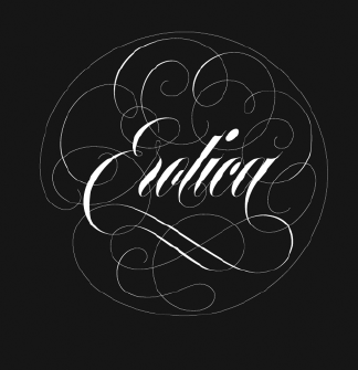
Maximiliano Sproviero, ‘Erotic’ type specimen cover
fig 8:
In 2013 the Argentinean type designer Maximiliano Sproviero published a script font he simply named ‘Erotic’. Here we see a return to the gesture of the hand, and its resulting abstract form, as a suggestion of erotic desire. The decorative, confident and lavish strokes of the letterforms are closely connected to the font’s name.When we look at the cover of one of the type specimens produced by Sproviero, to demonstrate the font (for sale), the letters are – rather obviously – superimposed onto a duotone stock images of a women wearing only lace lingerie. The crop of the image doesn’t fully reveal her face, and her anonymity is somehow subordinate to the letters themselves, which creates a slightly sleazy atmosphere. In terms of texts written about the font ‘Erotic’, it is usually the virtuoso execution of its letterforms that are analysed and celebrated by the different authors writing about it. Erotic’s letterforms, which are heavily decorative and bordering on illegibility, produce a sort of “empty zone” in which an (aroused) author can get introspectively and blissfully lost in their technical form.
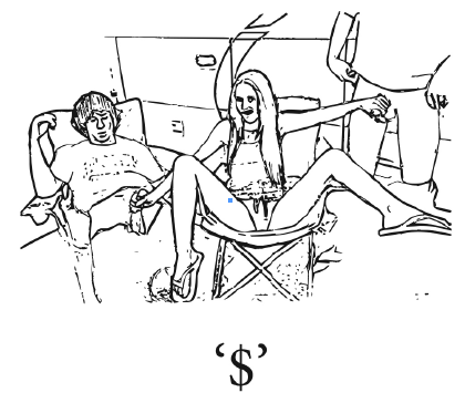
$ and ! in Trendy Pornography
fig 9:
Compared to the aforementioned examples Delage’s Trendy Pornography starts to look a little ‘rough’. But, through these other works, we encounter some ideas about what may have inspired him to design it. According to the accepted standards of a normal font file (like the one used to set the text which you are currently reading) Delage’s font is less than half-finished. Containing only 38 signs, we could suspect that his enthusiasm for it reached an early climax. ‘Trendy Pornography’ has glyphs only for the lowercase letters, digits and two punctuation marks – the other glyphs are blank. Yet the punctuation marks that Delage chooses to fill in his font are remarkable: the $ sign and the exclamation mark. Why, out of all the punctuation marks and signs in a font, would he choose just these? Perhaps the connection between sex and money, shock, climax and lucre are a good description of his desires connected with the ‘pop-erotic’ movement he has founded. ‘I think it makes people horny’ comments the user ‘Runedogs’ on ‘Trendy Pornography’s page at dafont.com – where the font has been downloaded 44,250 times; 14 times yesterday [as at 15 January, 2016]. Being a pictographic font you can’t actually ‘write’ anything with ‘Trendy Pornography’, so, as a tool for written communication it is rather useless. Taking from its namesakes, like pornography, it represents a predominantly male pursuit, that is explicit and leaves rela-tively little to the imagination. It begs the sug-gestion that if typography is the organisation and map-ping of words, then – similarly – pornography is the organization and mapping of sex. And, as a convention, a digital format and a piece of work, perhaps Trendy Pornography is not such an erotic thing after all.
* The author would like to thank Halla Einarsdottir and Lauritz Andersen at the Gerrit Rietveld Academie, Amsterdam for putting him onto ‘Trendy Pornography’.