When graphic designers engage with music, then sounds and people twist within intimate relationships. Ilke Gers offers a hole through which to see record sleeves and the world behind them. Exploring the sensuality around their typography and design. Ilke spoke with peers from the design scene, giving great insight into their connection to music. A precious collection of meandering interpretations of the sensual aura of the record cover.

Pet Sounds released on May 16, 1966

Recorded in 1965, released in 1966

Vol. 4 released on September 25, 1972
fig 1: CBNTBNT
Experimental Jetset
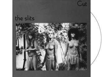
The term ‘tight but not touching’ refers to a specific way of kerning. In the sixties and seventies, when the practice of graphic design still involved writing long and elaborate instructions for the typesetter, the acronym ‘TBNT’ was used as a shorthand to let the printer know that the letters should be placed as close as possible to each other – without actually touching. This way of kerning is surely typical for the era of photographic typesetting, as the material proportions of earlier methods (wood, lead, etc.) simply wouldn’t allow for such a tight manner of spacing type. We certainly aren’t the first to mention the somewhat sensual undertones of the term ‘tight but not touching’ (apparently, type designer Hermann Zapf once referred to TBNT as ‘sexy spacing’). When asked to briefly say something about the relationship between typography, record sleeves and sensuality, we couldn’t help but bring it up again. Just like the TBNT-typographers of the earlier decades, we do believe in the dramatic tension that comes into being via this specific way of kerning. By placing characters as close to each other as possible, a certain magnetic energy is being generated in the spaces in between the letters; a tension that dissolves the moment the letters actually touch… To illustrate the principle of TBNT we wanted to show some of our favourite record sleeves featuring tight-kerned type; however, now when looking closely at the sleeves we had in mind – such as Pet Sounds by The Beach Boys, Volume 4 by Black Sabbath, and Unity by Larry Young – we realize just how wrong we were. All, or at least some, of the letters on all these sleeves are actually touching. Perhaps a better way to describe these sleeves though would be ‘close, but not tight-but-not-touching’ (CBNTBNT). Having said that, although these sleeves aren’t strictly TBNT, they all include some very narrow spaces existing in between the letters. And it is exactly in those interstices where one can sense bursts of dramatic tension, of magnetic electricity. After all, it is in the potentiality of touching – rather than in the touching itself – where the real action happens. —
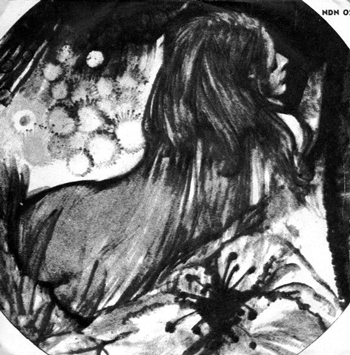
Favola per Adulti is one of the spoken-word records. The sleeve is one of the sexiest, and the spoken words are the dirtiest, nastiest ones and also the most sexist. Trivia: rumour has it that the male speaker is Riz Samaritano, a mildly popular swing/r’n’r singer in the sixties.
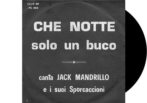
Che Notte is one of the anonymous sleeves: this cover does not differ so much from others in the same range. When you see a sleeve like this one, there is a 98% probability that it is a porn record.

Io Ti Amo is similar to Favola per Adulti, but – as you see – the sleeve has a strong psychedelic feel, although I think I have seen that picture elsewhere; it could have been a popular image in the late sixties/early seventies, as was the famous joint-smoking curly hippie girl poster.
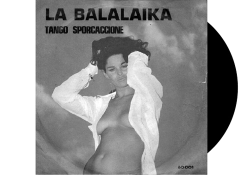
La Balalaika is perfection to me: lewd but not too much so, badly done and very recognizable.
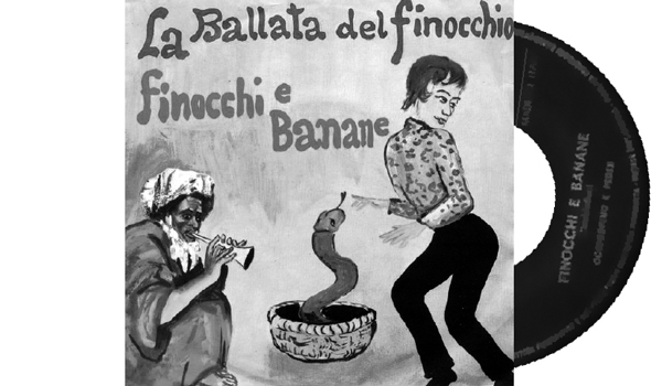
La Ballata Del Finocchio is another perfect cover, a great blend of homophobic, bad artwork and tongue-in-cheek. Please note: this is one of the few non-outlaw records as it was issued on FDM, which means Franco Del Mare, who is none other than Franco Trincale, the last of the great Italian ‘cantastorie’ (ballad singer) who still is one of the primary working-class voices.
I am telling you all this trivia because this might be the lewdest sleeve in my collection, and it could even have been legal, probably because it’s homophobic, and homophobia – in a Catholic country like Italy – has always been tolerated.
fig. 2: Italian Porn Music
Riccardo Frabetti
Riccardo Frabetti has been collecting records for over twenty years, starting when he was eleven years old. Attracted to ‘incredibly strange music’, which is also the title of two books of interviews with the world’s biggest collectors about erotic music, soundtracks, exotica and instrumental music, he used to hang out in a record shop in Bologna where he discovered Italian porn albums. Riccardo was interested in the records that formed part of the history of where he is from: ‘it is part of my story, it would be ridiculous to search for untraceable Chilean items for instance …’. These records were illegal, produced in a deeply Catholic state, in a particular time with restrictions censoring anything considered an obscenity. The fact that these records were not legal may mean that they have resulted in limited production runs and circulation, though there is no way to find out more about the production other than searching for the output.
Riccardo’s collection, classified simply as Italian Porn Music, consists of fifteen albums, ranging from the mid-sixties to early seventies. Almost every record is a bootleg, without copyright or names of authors or musicians, except for fictitious names as lewd inside jokes. It is precisely the anonymous artwork that gives the records their recognisability, almost like a trademark. While there are some ‘hot’ covers, Riccardo explains, there is nothing more explicit than bikinis, half-naked ladies and psychedelic-like erotic drawings. ‘One of them has a horrible sketch that is meant to be the representation of an orgy.’
The music, which is ‘something fugitive and wild’, is less interesting for Riccardo than the records themselves. ‘They suggest something revolutionary and sexually exciting due to the times they were made in, while Italian sensuality now is banal and not exciting at all. In almost twelve years of collecting I noticed there are three main threads. The first consists of famous songs with risqué lyrics. These are the most childish records, as you hear hits by Adriano Celentano, Patty Pravo or Mario Tessuto with lyrics about sex in its every declination and perversion, often played by awful musicians. The performed songs prove that the records are dated no earlier than 1967. The second strand is Liscio/Stornelli and is in a not very attractive vein, although it hides the brightest diamonds. It’s strictly related to Italian folklore. While Liscio is a popular folk dance originating in Romagna, Stornelli is a kind of vernacular poetry, a sort of a nursery rhyme or a signifying and the music is something between polka and waltz. The lyrics form a unique blend between country poetry and lewd lyrics that sometimes fall into blasphemy. Some of the records have a strong homophobic feel that alongside a deeply rooted sexism is something that has not changed in Italian culture. The third strand consists of spoken records and are my favourites as they often have background music and sometimes it is even good music. These records show Italian sexist mentality at its worst or best, if you’re looking for oddities, as I do, as the lyrics are usually performed by men calling women a whore and so on. Often there are both male and female voices simulating sex sounds like sighs. There are even some ready-made operations, as taking a song straight from a record such as Birkin-Gainsbourg’s Je T’Aime, Moi Non Plus and simply talking over it.
Released on 7 September 1979 on the Island Records label
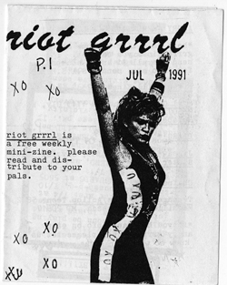
The first issue of Riot Grrrl zine, from 1991. Courtesy of Fales Library, New York University
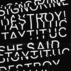
Signorine Taytituc / She Said Destroy!

Released in March 1993 on Kill Rock Stars
fig. 3: Signorine Taytituc
Erica Preli
The Slits album cover Cut, in which the band makes the choice to show themselves naked. The purpose of this is not to be attractive or sell music, but as a performative band, to use the female body as part of their message; here are our bodies, we show them, but we are in control of how we show ourselves. Rather than hiding or covering up, it’s about being empowered. ‘At least half of the members of male punk bands would be performing half-naked, and The Slits wanted to show that women could do it, too; making a stand by using and showing their bodies how they wanted to – and it doesn’t mean that you’re allowed to touch, just because we’re just showing our bodies.’ Riot grrrl was an underground feminist hardcore punk movement in the nineties that empowered all-female bands. Showing and using the female body, as well as behaving in a different, liberated way on stage, provided a space for women in a punk and hardcore scene that was originally dominated by men, and often violent and misogynistic. The movement was about getting back and re-appropriating the symbols and language of punk. Apart from moving and using their bodies freely, the DIY aesthetic of punk was reclaimed.
Kathleen Hanna, the lead singer of feminist punk band Bikini Kill, was an important figure in this movement, using the typical punk aesthetics and zine making as part of a recognizable scene. When I visited New York for the first time I went through the archive of material Kathleen Hanna has produced, since I have always been interested in the idea of having the agency to make one’s own music and visuals. A big part of the original appeal of being in a band was to design the covers and the posters. Signorine Taytituc, the band I’m in with Serena and Claudia, is part of a music scene, and therefore it makes sense for us to be coherent in aesthetic and awareness towards the audience we are talking to: if you make a certain kind of music, like punk in our case, you also want to be recognizable for the audience who listens to this kind of music. When designing our last album cover, a collaboration with another band She Said Destroy!, both bands talked about wanting to fit in the punk aesthetic. It was important that the sleeve was handmade, searching for the feeling of materiality. The text is printed out, cut-and-pasted, scanned and then modified on the computer, so the results don’t include anything that can’t be produced with a Xerox machine. Through this process of making records I’ve come to realise the sexuality of the object: with this particular record more than with the previous ones due to the way we treated the various layers within the object – a black-and-white cover, colour inside and the red vinyl. As a final object it connects with the body in its physicality.
When you make music, you have an idea what your music ‘looks’ and feels like, and I think it would be difficult not to be involved with the design process. However, my position is that of somebody involved with DIY production, where choices are up to you, and not having to make compromises when it comes to the design and visual aspects of the album is part of the attitude of the music and the scene.—
Eva Crane
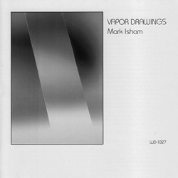
Mark Isman, Vapour Drawings, 1983
fig. 4: Emotion
Femke Dekker
The first thing that attracts you to an album is surely the sleeve. The recognizable size catches your eye, the physicality of the format; its magic works a bit like a book does, but even more so. You see a cover and immediately respond to it; I think ninety per cent of the time an album appeals to emotion, and sometimes you can even pinpoint in what way it’s triggering emotions, while other times, it just hits you directly. I often see a cover and imagine what the music on the record should be like. Some stores offer the chance to listen to albums before buying them, so you don’t have to rely on previous knowledge or filter through producers on liner notes, or just hope that a sleeve will lead you to great music.
In the collaboration with Nicole Martens as Strange Boutique, we recently released our first track, Eva Crane, honouring the first female scientist to win the Nobel Prize. Through Fanfare, who released the track, there were three different covers by different designers. We would usually create the artwork and visuals, since Nicole is also a designer, but for this particular release we developed an installation instead. It was partly inspired by the cover of Vapor Drawings by Mark Isham that had been designed by Anne Robinson, the co-founder of record label Windham Hill Records. The installation consisted of different layers of transparent material that were projected onto, and throughout, the space, so that the environment changed with the natural light and slowly disappeared through the course of the night. It created a continually changing atmosphere, which is how we think about our imagery in terms of having a particular structure that allows it to also be organic, while at the same time dealing with the durational aspect of music which is perhaps experiential, a sensual dimension that is so hard to
pin down.

Released on 4 February 1977
fig. 5: Rumours
Karoline Swiezynski
I came to Fleetwood Mac pretty late via my stepdad. One day I found his Rumours CD at home and he told me his connection to this album. Listening to the ‘break-up’ album, as he called it, helped him overcome the divorce from his first wife. And it really is the best album to listen to when you’re going through or have just had a break-up. Fleetwood Mac consisted of two girls and three guys; there were two couples who were both breaking up during the recording of this album. A recipe for rumours anyway, with all the dramas with couples and bands, and couples in a band. But to me the album is pretty much a universal drama, though the cover looks like a seventies fairy tale with its hand-drawn title and ballet pose. A couple of years later, a friend pointed out something on his copy of the Rumours LP cover that I’d never noticed. Have you ever seen the balls? The cover shows one of the couples in the band, and the man has a pair of balls hanging from his pants, between his legs – just two shiny balls. Apparently it is some object they kept from their first show, but still, when you look at it you can’t help but wonder what’s the intention of these dangling balls?
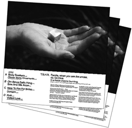
Black Heart Rebellion
People, when you see the smoke, do not think it is fields they’re burning
fig. 6: Synaesthesia
Valentijn Goethals
Every Black Heart Rebellion song and album has a particular colour association for Valentijn Goethals. ‘My band members often joke with me before we play a song, asking “what colour is this song?” and I’d say green or whatever colour I think it is. It just happens naturally and feeds into ideas when I design the visual material for the band.’ Valentijn has been designing the band’s visuals since they formed to avoid having to pay somebody else. ‘I was in design school when we started making our first albums, and it was a challenge to think about being a designer and a musician in a metal band at the same time. Straight away there are conventions of metal as the background from which we started, and next to this there was my ambition to do interesting design. In a certain way the early albums have been conventional but I would talk to my tutors about them, and from the first album I used Helvetica, so there was an attempt to think about being in a metal band from a different perspective. Our albums are now different from the music scene we are in, which we are trying to break open as much as possible. We still have a metal audience and function in its scene, since we started within it – and we scream and play with the drama of it – while the music has evolved along with the visuals.’ The band’s latest album People, when you see the smoke, do not think it is fields they’re burning, is the ‘gold’ album. ‘The music and therefore imagery has a golden, shining atmosphere for me. The design came together intuitively, simply showing everything that’s already there, involving my close sur-roundings.’ The album is made with collaborators that the band often work with, like Mirjam Devriendt, who always does the photography, and Ine Meganck, Valentijn’s girlfriend, whose hand is used in the cover image. The object Ine is holding in the cover image is a cube of pyrite – fool’s gold, which Valentijn has been collecting since childhood. The shoot took place over summer in a greenhouse in Gent where the band lives. ‘The idea for the album grew over a couple of months in which different elements came together. When you google the mineral pyrite there is always an image of somebody holding it as an object in his hands to give a size and colour registration. Using a natural feminine hand makes for a contrast to this dramatic masculine music; the image is more like fashion photography with the allure of a beautiful hand holding a desirable object, and is then produced in the aesthetics of fashion magazines.’ All the images have a high-gloss varnish, so it’s extremely shiny and rich in colour. Inside the album cover this simple gesture of a hand holding an object is repeated with Valentijn holding gold tiger bells, which he uses for the first time as an instrument in this album, and there’s also a photo of the gold reflection screen used for the photography. ‘These images used inside the album cover show a kind of practical continuation of the gold elements that make up the album, while the cover stands out as something very sensuous with a hint at the occult.’
fig. 1: Experimental Jetset, founded by Marieke Stolk, Danny van den Dungen and Erwin Brinkers, is an independent graphic design studio based in Amsterdam. Their work often has a typographical focus, and just as their name, deriving from the Sonic Youth album Experimental Jet Set, Trash and No Star suggests, they count music – from psychedelic pop to post punk – as a continuing influence.
fig. 2: Riccardo Frabetti lives in Bologna where he started playing in bands, collecting and writing about records and sometimes advising designers on record cover artwork.
fig. 3: Erica Preli is a founding member of EEE Studio, a graphic design studio based between Bologna and Ravena, and drummer in all-female punk band Signorine Taytituc, whose albums and visual material she designs.
fig. 4: Femke Dekker is part of various music and design initiatives including JA JA JA NEE NEE NEE, Strange Boutique and My Little Underground, taking up roles of curator, moderator, advisor as well as Director of Students at the Sandberg Institute, Amsterdam.
fig. 5: Amsterdam based independent designer Karoline Swiezynski recently celebrated four years of designing the monthly calendars for OCCII, a stage for underground and radical music acts.
fig. 6: Valentijn Goethals is the co-founder of independent record label Smoke and Dust, is part of artist-run exhibition, concert and work space, 019 in Gent, and along with his graphic design and art practice plays bass guitar in the band The Black Heart Rebellion.